Users of the Guest list can modify the default fields of the Guest form to better accommodate their use case. To reach maximum customization, the Custom Form feature can be enabled.
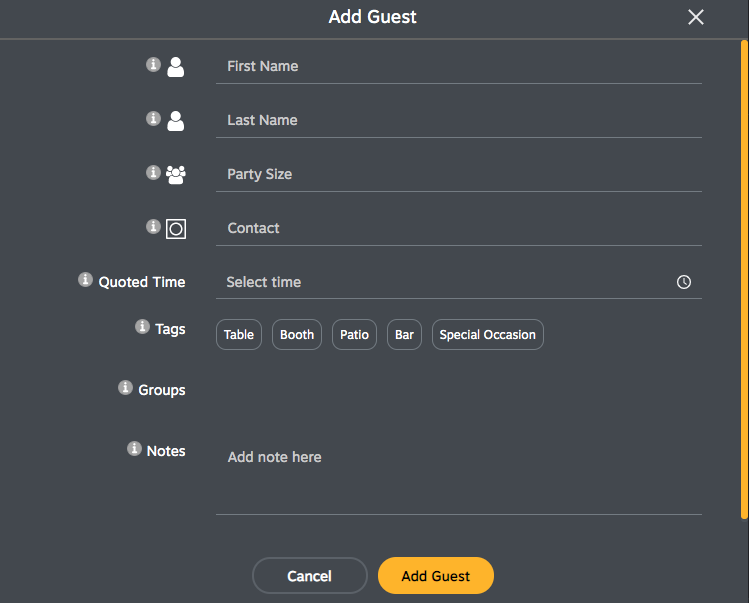
Default appearance of the Guest form
Default fields
Text - Use the text field to capture free-form alphanumeric text. If the field is marked as “required”, then at least one character must be entered.
Text Area - Use the text area field when the field requires a large description. The text area field has a resizing control to let people change the size of input area. If the field is marked as “required”, then at least one character must be entered.
Party Size - Use this field to capture the size of the party as it is being added to the queue. Note that this field matches the functionality of the premium field Numbers.
Contact - Use this field to capture the notification method you would like to use to when communicating to your guests. This field accepts pager and cell phone numbers.
Quoted Time - Use this field to select the target time to notify your guests.
Tags - Create tags to quickly associate guests to a preference or service.
Groups - Create group tags to easily group guests as they are being added to the list.
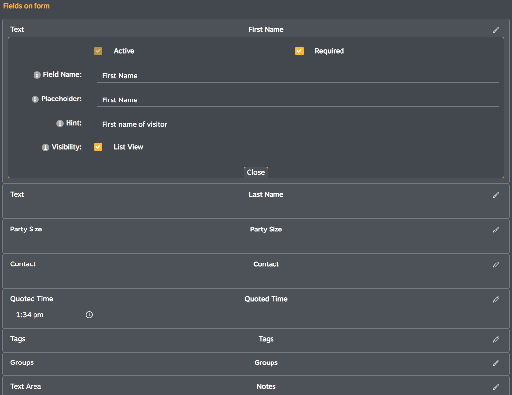
Below is a grid for quick reference of the default fields in the Guest form.
| Field Name | Field Type | Required* |
Default Hint* |
Placeholder* | Visibility List view |
|
First name |
Text | Required | Customizable | First Name | Optional |
| Last name | Text | Optional | Customizable | Last Name | Optional |
| Party Size | Party Size | Optional | Customizable | Party Size | Optional |
| Contact | Pager or Cell number | Optional | Customizable | Contact | Optional |
| Quoted Time | Time | Required | Customizable | Select time | Optional |
| Tags | Custom tags | Optional | Customizable | Optional | |
| Groups | Custom groups | Optional | Customizable | Optional | |
| Notes | Text Area | Optional | Customizable | Add note here | Optional |
*Editable, open the field to access the configuration options
Configuring fields
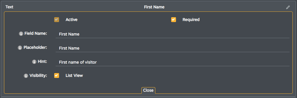
To make changes to your Guest form, navigate to the Settings of the list and scroll to the the Guest form section. Here you'll be able to:
- Sort - click and drag fields to sort and rearrange how these are displayed.
- Field Name - edit the names of the fields.
- Active - mark fields as active to make the field visible and available for data entry. NOTE - fields can't be deleted. This preserves the data integrity of the form by retaining any information gathered on a previously active field. Fields can be inactivated to stop collecting answers on them.
- Required - mark fields as required to ensure the piece of information is collected for every guest added to the queue.
- Placeholder - customize placeholders for each field, this inline helper text guides the user on the purpose of the field.
- Hint - customize the hint (text shown on the information pop-up when user clicks on on the (i) icon).
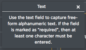
Example hint describing the purpose of the Text field type.
- Visibility - mark the field as visible in the list view of the queue, when selected a column for the field will be added
Custom form
To reach maximum customization, the Custom Form feature can be enabled to unlock premium field types.
Premium Field Types
- Number - Use the numbers field to enter numeric characters only. Alpha characters are not accepted in this field. If the field is marked as “required”, then at least one character must be entered.
- Date - Use the Date field to enter a date associated to the session. Type in the date or choose a date via a date picker calendar. The calendar pre-selects today’s date.
- Single Select - Use the single select field to gather an exclusive selection. Set as many choices as needed or use this field to record Yes or No preferences. Available choices are displayed with a radio button.
- Multi Select - Use the multiple select field to allow for multiple selections. Create as many choices as necessary. Available choices are displayed with a checkbox. If the field is marked as “required”, then at least one character must be entered.